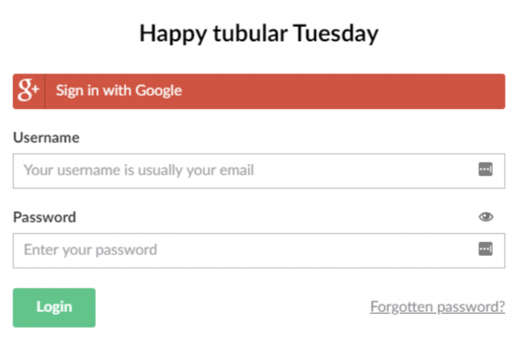
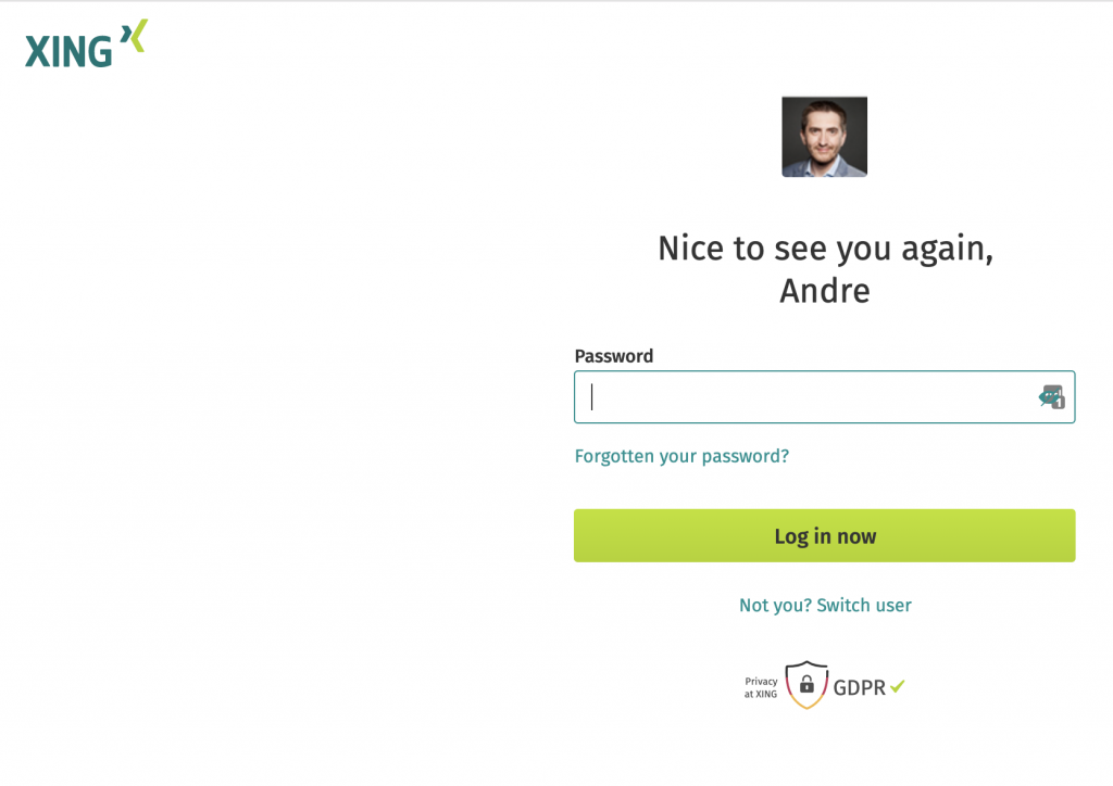
Something I notice quite often on login pages when you use services like www.lastpass.com : here on www.xing.com the password field has an eye icon on the right side, and lastpass shows the possibility to fill with password field from my vault.
But, the … icon and the eye icon are placed exactly at the same location.
So these password retrieve services become frustrating to use.
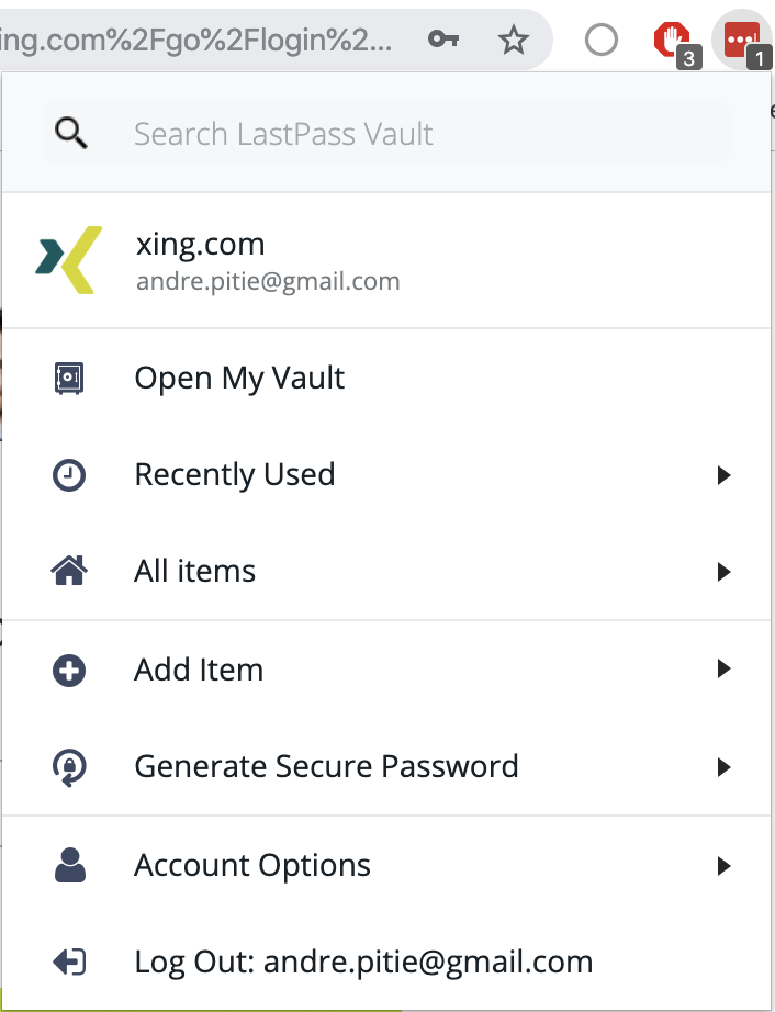
As a result, these password vault tools, like lastpass are not that easy to use and I have to go to the top of the browser to open my vault, not great.
I notice some already found some solution: display the eye icon to hide/display the password on top of the field and not inside:
https://issues.umbraco.org/issue/U4-10839